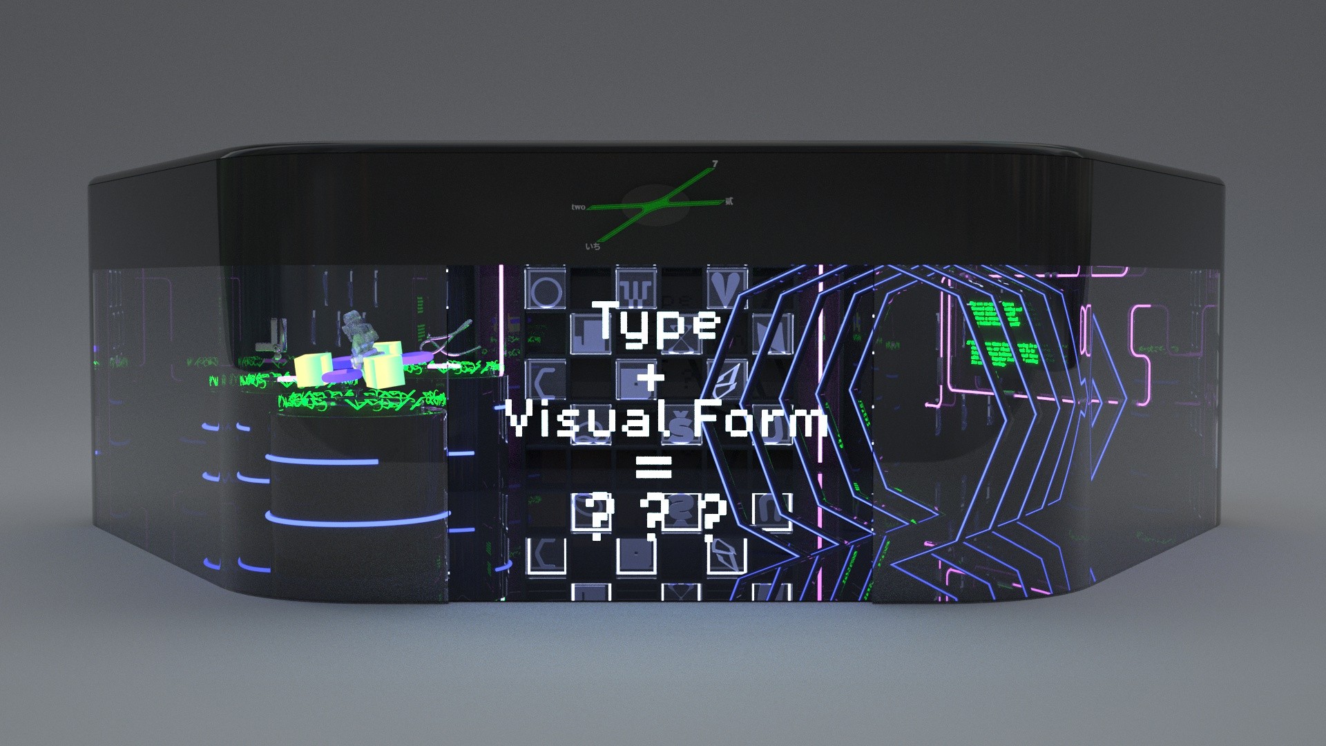
28" x 44" size poster design in black and white used coding program + Enlarge
Type + Visual Form = ??? (Poster) 01 2021 Code design: p5.js 28" x 44"
28" x 44" size poster design in black and white used coding program + Enlarge
Type + Visual Form = ??? (Poster) 02 2021 Code design: p5.js 28" x 44"
Type + Visual Form = ??? (Video) 2021 AE & P5.js 1280?×?800px
Type + Visual Form = ??? (Interaction poster) 2021 p5.js 1100 x 800px

Move mouse to interact Keyboard press A-Z change letters (mouse click image) Click Download or Keyboard press ’space’ to save image

+ Enlarge
Type + Visual Form = ??? (Type design) 01 2021 p5.js 1280?×?800px
+ Enlarge
Type + Visual Form = ??? (Type design) 02 2021 p5.js 1280?×?800px
+ Enlarge
Type + Visual Form = ??? (Type design) 03 2021 p5.js 1280?×?800px
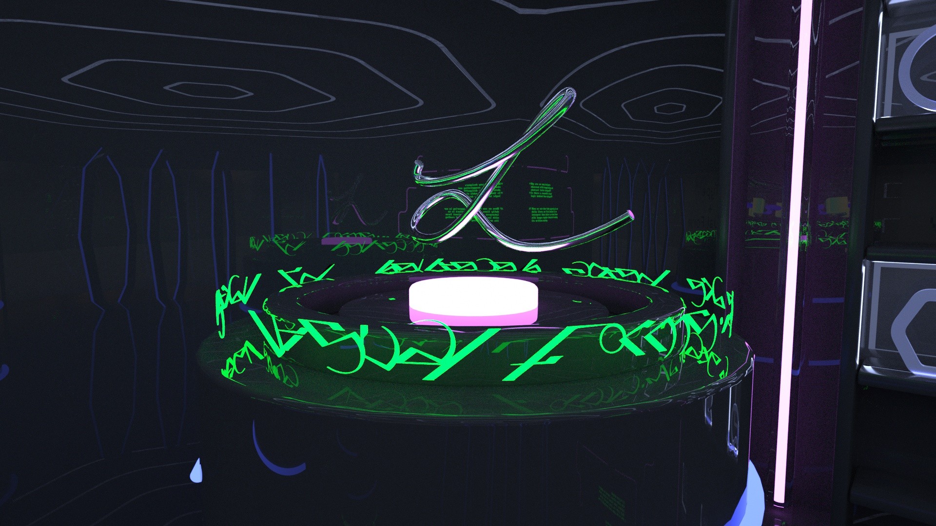
I designed a virtual space to exhibit the  typeface as artificial sculptures. + Enlarge
Type + Visual Form = ??? (3D design) 01 2021 C4D 1920 x 1080px
I designed a virtual space to exhibit the  typeface as artificial sculptures. + Enlarge
Type + Visual Form = ??? (3D design) 02 2021 C4D 1920 x 1080px
I designed a virtual space to exhibit the  typeface as artificial sculptures. + Enlarge
Type + Visual Form = ??? (3D design) 03 2021 C4D 1920 x 1080px
I designed a virtual space to exhibit the  typeface as artificial sculptures. + Enlarge
Type + Visual Form = ??? (3D design) 04 2021 C4D 1920 x 1080px
I designed a virtual space to exhibit the  typeface as artificial sculptures. + Enlarge
Type + Visual Form = ??? (3D design) 05 2021 C4D 1920 x 1080px
Statement

My thesis project is a journey to explore the boundaries of language and meaning. I chose typography as the entry point of the language and used code programming as a design tool to diminish the text information while expanding the visual effect. A system was designed by using coding language, which can create many visual effects on the typography. These effects are semi-illegible but convey interesting formalism. In this experimental process, I consider the following questions: Why are so many designers obsessed with exaggerating and abstract letter designs? Is there a reasonable visual logic behind these designs? Does visual enjoyment replace the importance of meaningful communication? Are we being deceived by all kinds of formalism?

Graphic Design (BFA) Students